Why blend in when you can stand out? Embrace bold colors, quirky patterns, and that little bit of whimsy that makes life pop! Designing graphics is like painting a canvas with the vibrant colors of creativity and functionality. It involves blending artistic flair with strategic thinking to create visuals that capture attention and convey messages effectively. Every line, shape, and color play a critical role in telling a story or evoking emotions, whether it’s through eye-catching logos, whimsical illustrations, or sleek infographics. The challenge lies in balancing aesthetics with purpose, ensuring that each graphic not only looks fabulous but also resonates with the intended audience.
Make it stand out
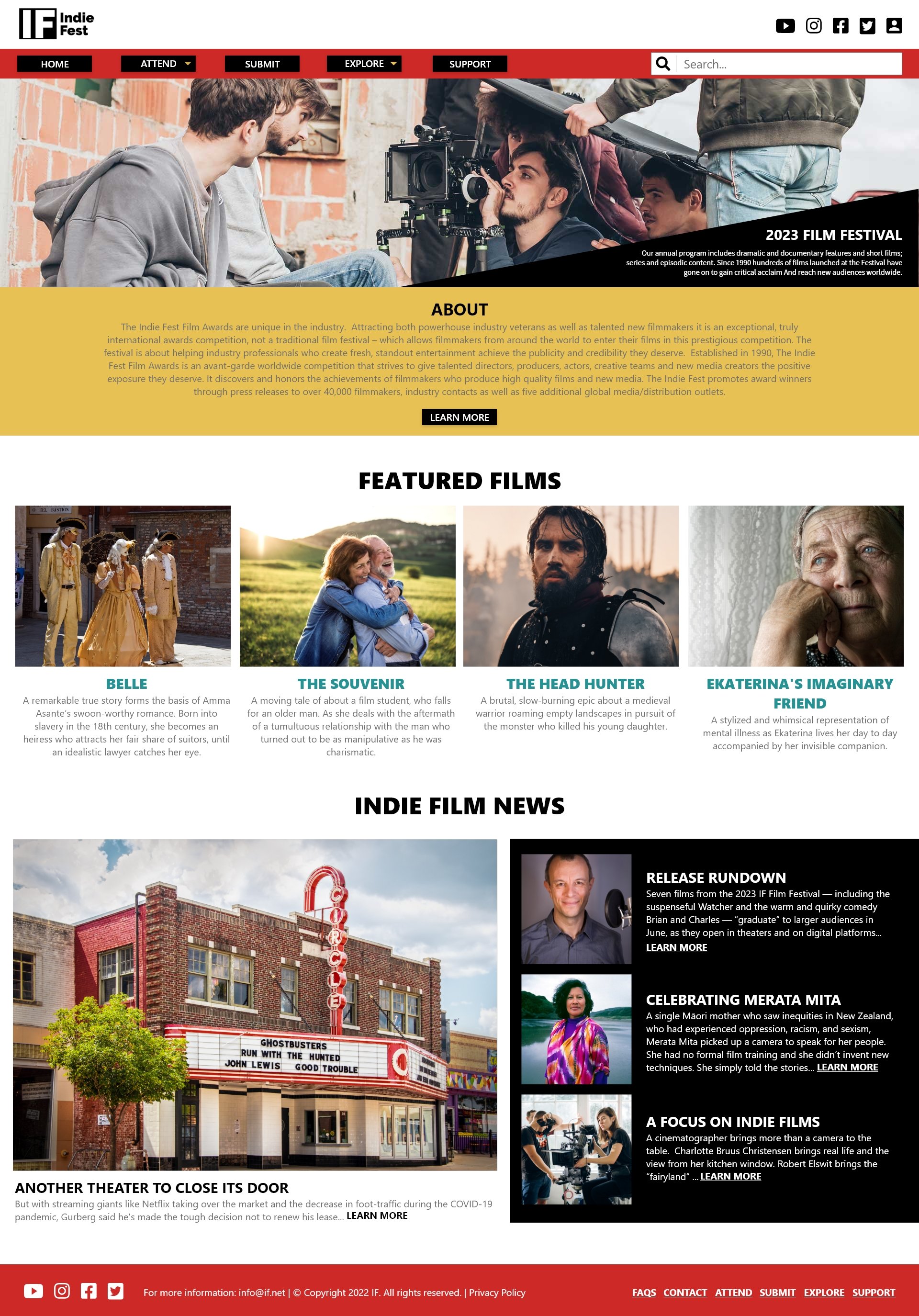
Indie Fest
Indie Fest
Film Festival
In the course of my Google UX Certificate program, I had the exciting opportunity to create a fully responsive website dedicated to showcasing an Independent Film Festival. You are invited to explore my comprehensive case study presented below, where I delve into the design process, challenges faced, and the final result of this cinematic adventure!
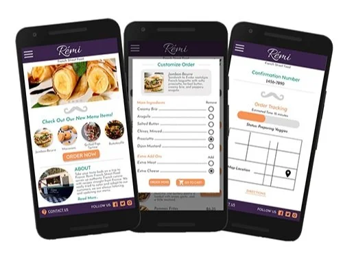
Remi - French Street Food
As a Google UX Certificate student project, I proudly developed a mobile ordering app specifically designed for Remi, a high-end gourmet food truck that serves delectable dishes. This app is crafted to enhance the customer experience and streamline the ordering process. Feel free to explore my detailed case study below!
Make it stand out.
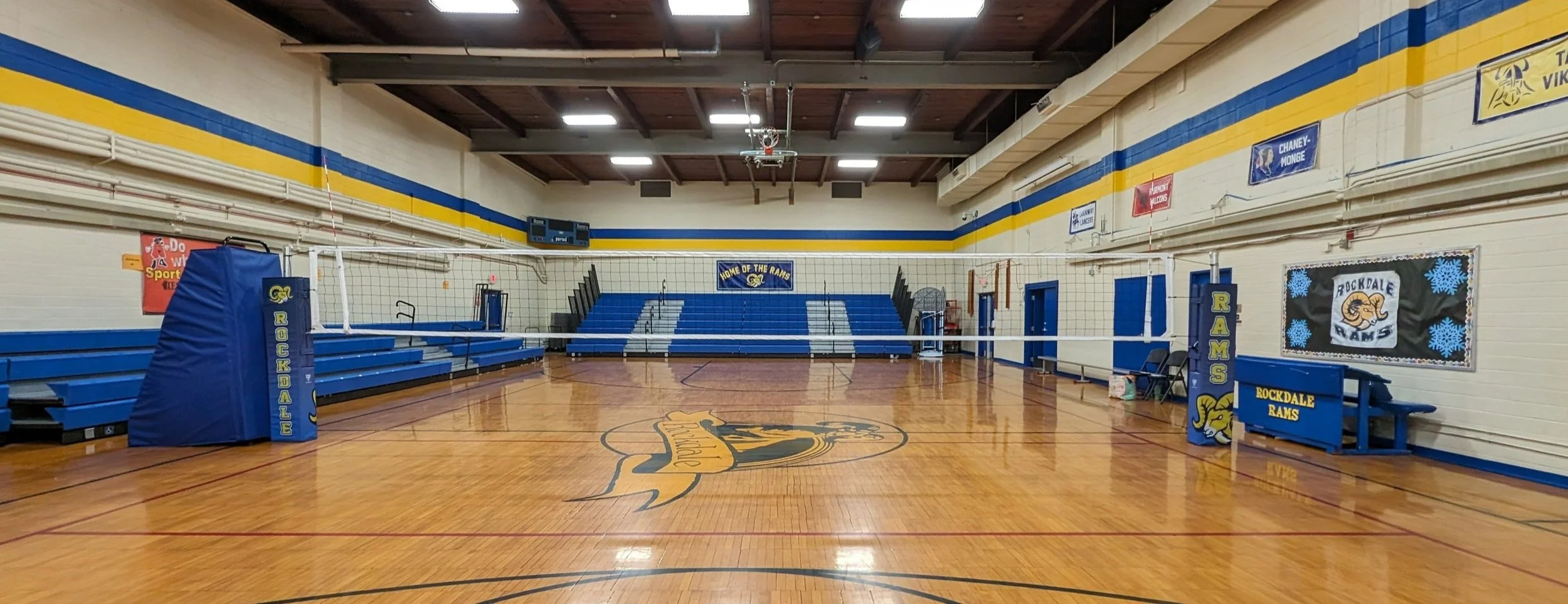
United Volleyball Supply
Sound Publishing
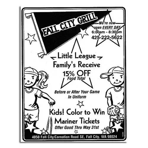
Included here are several delightful and eye-catching examples of vibrant newspaper advertisements that I carefully crafted for the charming Sound Publishing branch nestled in the beautifully picturesque Snoqualmie Valley, WA. These creations hold a special place in my heart as they not only represent my very first client but also mark my first award-winning success in the world of advertising.
San Joaquin RTD
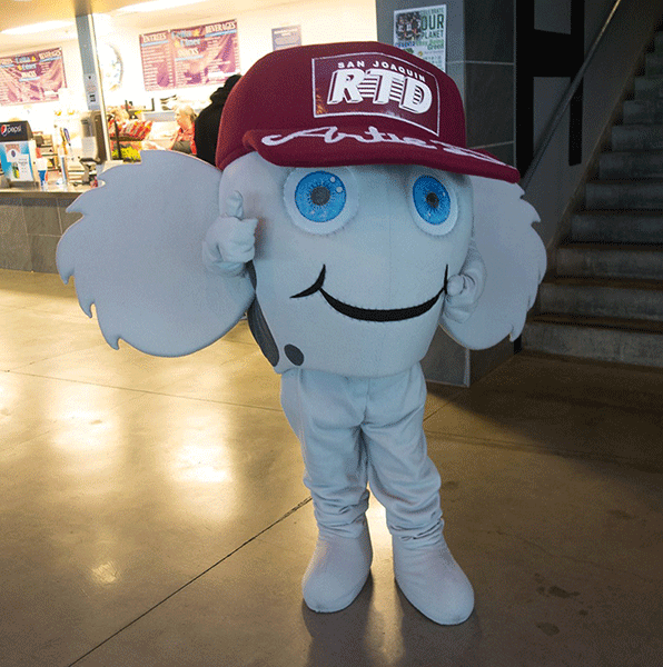
Designing promotional and event items for the San Joaquin Regional Transportation District was all about capturing the essence of community connectivity and sustainability while infusing a playful touch. It was rewarding to be a part of turning a standard event into a memorable and enjoyable experience, encouraging more residents to hop on board with local transportation.
Bonanza Pull-Tabs
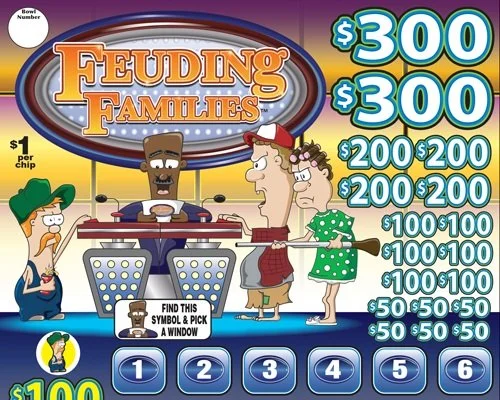
Working in-house at Bonanza Pull-tabs felt like a dream come true. It was a perfect blend of my passion for design and illustration, with projects that were anything but mundane. They often teetered on the edge of being audaciously bold. My easygoing nature meant that I embraced the client's requests with enthusiasm, finding them to be both enjoyable and stimulating challenges. With a plethora of exciting projects, it's been quite the task to select just a few highlights to display here.
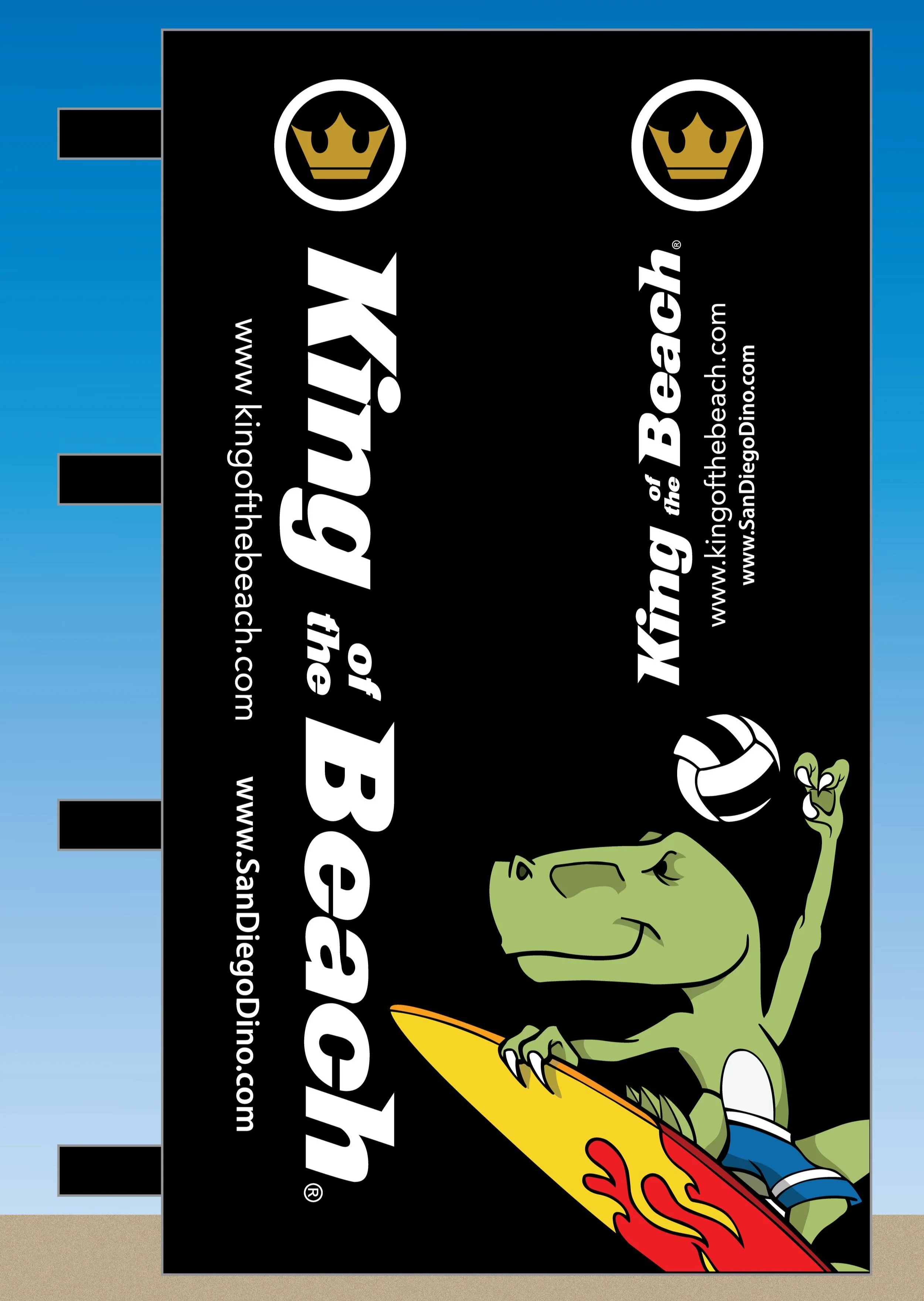
“I wanted to thank you all for your contribution to the making of our KOB/SD Dino volleyball equipment. The net and pole cushions are beautiful. We really appreciate you putting a rush on our order. I’m sure it wasn’t easy and really shows your professionalism and hard work. Looking forward to doing more business with y’all and hopefully one day crossing paths.”
Troy Reeb - SD Dino
Testimonial

